LOGO


On the back of the postcard, I included my mouth drawing with a QR code inside. I like how the QR code can eliminate the need for more copy on the post. This keeps is clean, and draws more focus onto the art, while still allowing viewers to access all the information they need about the event.


ALBUM RELEASE


To create my logo, I focused on the aesthetics that have been inspiring me lately. As I collected images that represented this, I narrowed in on patterns that were arising in textures and colors.
To create promotional material for my dance production MOUTHFUL, I used a lot of the same inspiration that I used for my logo, because this project is derived from personal stories, as well as what has been inspiring me lately in terms of visuals. I came up with the image of a grid to represent some of the themes I play with in the show. Like my logo, this was hand drawn. I kept the color palette to black, white, and grey. When picking the typeface, I wanted something simple, but that felt a bit formal. I like the way this more traditional type juxtaposes the more futuristic style of the colors and the grid.
The poster was where I incorporated imagery from Hedwig and the Angry Inch, with the concept of intimate partners splitting apart. I drew two abstracted faces with space dividing them. In the open space was where I placed all of the tour dates. The way they zig zag through the poster is a bit irregular when considering a standard concert tour poster, which I think fits in line with the band’s brand.
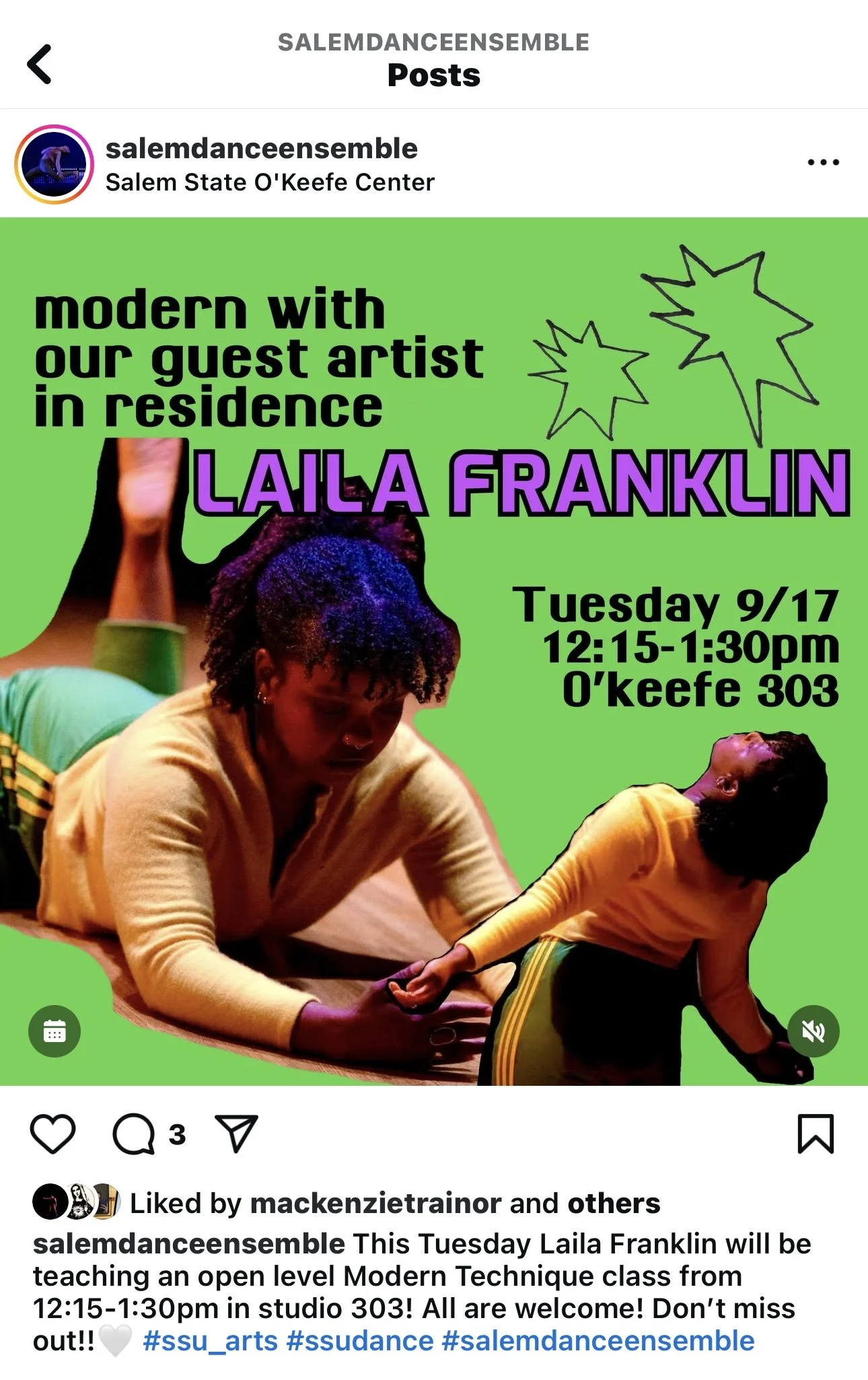
SALEM DANCE ENSEMBLE GRAPHICS
For one, I used an irregularly shaped star, which is a shape that appears in a lot of my work. In another, I used figures in a moment of counterbalance, which is representative of the kind of dancing I engage in.


I landed on a neutral color palette of black, white, and grey, as well as textures like lace and netting. I knew I wanted the logo to describe the kind of art I make, as well as the person I am. To incorporate this, I hand drew all of the logos, and then edited them with photoshop.

MOUTHFUL PROMO

In creating this material for Yoshimi Battles the Pink Robots by the Flaming Lips, I not only tried to derive images from the sounds of the music, but I also paid close attention to the brand of the band. Most of the Flaming Lips covers are very artistic and a little abstract, which was perfectly in line with the kind of work I make.
I gathered images that felt representative of the music, and I was taken to a very queer space. Images of disco balls, and themes from Hedwig and the Angry Inch appeared for me. This led me to create an abstracted painting of disco ball lights for the cover, and a high heel as a gun for the back cover. I chose a typeface that felt futuristic, but perhaps for the time of the early 2000s, when the album was made. The color palette was pretty narrowly in black and white. This was to allow the moments of pink to pop, as it references the title of the album.


